Why software is hard: A visual guide

A picture is worth a thousand words. What does this image suggest to you?
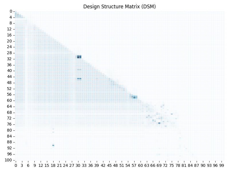
This is a Design Structure Matrix (DSM), a visual summary of how 5,000 files and 150,000 symbols in a software system interact. In this context:
- A file refers to a source code file.
- A symbol represents a function, class, or variable defined within a file.
Each axis of the DSM represents files, and each square indicates a dependency or interaction between them. But there’s more to the story.
The DSM you see here is summarized. The original matrix was 5,000 x 5,000, mapping file-to-file dependencies—where a symbol in one file is referenced (e.g., called or used) by another file. To make patterns easier to interpret, the DSM has been aggregated into a 100 x 100 grid. Each square in this grid represents 50 x 50 files from the original matrix, and the intensity of the color reflects the total strength of interactions within that block.
Now, consider the scale of a symbol-to-symbol matrix. Instead of files, this would map every function, class, or variable and its relationships—producing an even larger and more detailed view of the system’s complexity.
This summarization helps highlight larger trends, such as the dense lower triangle (expected, orderly dependencies) and the scattered upper triangular marks (unexpected, problematic dependencies).
The fullness of the lower triangle suggests dependencies are spread widely—some symbols (such as functions or variables) in certain files are referenced by nearly 1,000 other files.
What does this pattern tell us? If I told you the company with a system like this struggles with onboarding, making changes, and testing, would this picture provide an explanation? Might it suggest why their system feels brittle and hard to work with? I wonder what else it reveals.
Here’s some additional context: In creating this DSM, 15,000 cycles—circular dependencies where one file indirectly relies on itself—were identified and removed by cutting a single edge (a direct connection between two files) in each case. This process ensures the system can be organized into a topological order, where dependencies flow in a clear, forward direction. This is why the upper triangle is as clear as it is.
For me, seeing the system in this way is a first step. Having the image—and more importantly, the underlying data in an interrogable form—could empower architects and product owners to start making targeted refinements. With AI’s support, it becomes easier to identify hotspots where modest, strategic investments could reduce complexity and improve flexibility.
What insights could this view provide for your systems? How might it confirm what you already know—or reveal something unexpected?